Exercise: Getting to know your brushes.

I prefer to use synthetic flat and round brushes for my work. But I have a large collection of brushes of all different fibers, sizes and shapes.

I am not so great at painting fruit. When I added white to lighten the red that I used it went into a pink colour which I am not so fond of. The shadow also needs to be much darker. I do plan to do more work on this and I will add it under this piece.
Exercise: Applying paint without brushes.

Perhaps a mixture of all three colours making black could have added more contrast to the piece.
Exercise: Tonally graded wash

I used Winsor and Newton's Acrylic Infinity in Rose diluted with water to make the colour almost vanish towards the edge of the page. When it was wet it looked perfectly graded but as it dried it was not so perfect. However using it as a base for a painting I do not consider it to be unusable. I would however need a more perfect graduated canvas if I was painting the sky.

The last graded wash looked better on the canvas but with the photograph it looks similar to the first one.
Exercise: Overlaying washes

I used acrylic, Atelier Brilliant Orange as the base and when it was dry added Finity Rose. I enjoyed using this method to beautiful intense almost pure colour of the orange and rose at each end of the canvas and a combination of both colours in the middle section. Both colours have merged in the centre well I think. The technique used to build up colour glazes would make a great base for a floral painting in my opinion. I like to use acrylic in this method under oil paint. I found the colours I used very easy to blend, probably because they were acrylic and diluted very easily with water. When I use oil paint I like to make a mixture of odourless turpentine and linseed oil to dilute the oil paint. I find using that combination of 50% of each that my paintings dry much faster than just using linseed oil.
Exercise: Opaque colour mixing

The first two colours of my acrylic diluted with white when on smoothly. I actually started from the right and worked to the left adding white as I went along. My acrylic paint is a little on the old side as I prefer to use oil and the most I would use acrylic is to paint a canvas so that I have a great colour on which to paint in oil. I prefer mixing with the white to get a rich deep paler colour as opposed to just plain water which gives a transparent appearance. The paint looks more to me like an oil paint which I prefer. But I consider using acrylics with the water is a little like watercolour. For me personally, acrylic is like using something between watercolour and oil but without the benefits of either the watercolour or the oil. I also do not like the way acrylic dries very fast, and I have tried the mediums to slow down the drying times. The reason I used acrylic in these exercises is that they do dry fast.
Exercise: Monochrome studies

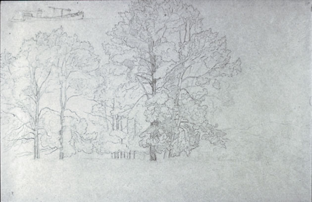
USING A LIGHT GROUND AND PAINTING WITH A DARK CONTRASTING COLOUR.
The strength of this piece of work is the dominant colour of the trees against the white background. I like the drama of the two colours. It is easy to use the finer brush to paint in smaller branches at the top of the tree.

USING A DARK GROUND AND USING THE BACKGROUND TO MAKE THE SHAPES OF THE TREES.
I liked the effect but I felt like I was trying to paint blindfolded or with my left hand, and it was uncomfortable for me. I did not leave space for smaller branches at the top of the tree so it appears to be a bit 'cut off', I do however like the shape of the trees and would consider perhaps using this approach to get more intersting shaped trees in future.
I plan to work more on this painting then post it to the blog.
PROJECT: WORKING ON DIFFERENT COLOURED GROUNDS
I made several drawings of three items in my sketch book.


And after careful consideration decided that the bottom sketch would make the most interesting composition for a simple still life.
Exercise: Tonal study on white ground.
The colour I chose to use was Prussian Blue in oil.
The following painting was done on a pure white canvas sheet.

I really enjoyed the process of this painting. I actually made ten shades of prussian blue and white and found to be very enlightening to use this method of painting.
Exercise: Tonal study on a dark ground.

I think that it lacks the luminosity of the previous painting done on the white back ground. I did not find it easier to use the darker back ground as I wanted to use different tones as in the previous painting of the paint and therefore had to work as much on this painting as the previous one. Perhaps this would have been a more interesting piece of work if I had left more darker areas particularly where the shadows are on the left and bottom of the painting.
Research Point: Chiaroscuro, the contrast between dark and light.
The following works exemplify chiaroscuro effects.

This magnificent painting done in 1594 'The Last Supper' by Tintoretto, an Italian painter who died the same year must be one of the best examples of using chiaroscuro.


This magnificent painting done in 1594 'The Last Supper' by Tintoretto, an Italian painter who died the same year must be one of the best examples of using chiaroscuro.

'Find the Body of St Mark' 1562 is also another beautiful example of Tintoretto masterpieces.

'Boy with a Basket of Fruit' 1593 by another Italian painter Caravaggio.
Both Italian painters, Tintoretto and Caravaggio were greatly impressed by Titian, who was perhaps one of the most influential painters of all time.
The following is a beautiful example of one of his paintings he completed in 1548:


Both Italian painters, Tintoretto and Caravaggio were greatly impressed by Titian, who was perhaps one of the most influential painters of all time.
The following is a beautiful example of one of his paintings he completed in 1548:

'Equestrian Portrait of Charles V'
The following painting by Peter Paul Rubens was also influenced by Titian. It is extremely dramatic and the artist has made outstanding use of the 'chairoscuro' method of painting using dark and light, It is almost you have to look at all the places in the painting to discover what is really happening.

'Prometheus Bound' 1611-1612


The Italian painters were not the only artists to embrace 'chiaroscuro' but judging by the word they must have been the first.
Other great artists of that time were also using this method.

'The Stolen Kiss' By french painter Jean Honore' FRagonard 1756 is an excellent example.
Also this example of this painting called 'Kitchen Scene' by Dutch painter
Peter Wtewael in 1596.

An english painter Joseph Wright of Derby was also a master of the technique known as 'chiaroscuro'.

'A Philosopher by Lamplight' 1769

'A Cavern, Moolight' by Joseph Wright of Derby.


ASSIGNMENT 1.
I started with a quick sketch of my three still life articles, the plant, the bottle and the pear wrapped in paper. In all different positions to try to make the best composition for the piece.


I liked this composition the best, so I added come colour using intense blocks. I think perhaps a smaller piece on watercolour paper using water colours would have been more successful, but once I started there was no turning back. I wanted the background to be more muted than the charcoal lines in this plan.

I worked out which colours I wanted in oil, probably it would have been more beneficial to do several smaller drawings with differing colours so that I could see which was best.


I did the drawing on a piece of red coloured paper that I had done in the previous exersices. I thought that the red would be a great colour for the green foliage. The bottle I had was green so I changed it to red to enhance the painting. At this point I wanted just to block in the colours and then I re-drew the shapes of the shadows in the glass bottles and on the foliage.

I wanted to put the darks on the right hand bottom.

After much consideration this is the point I have arrived at. I could do more work to this piece I think perhaps the stark whiteness of the paper around the pear is too much and needs toning down. I also feel there is not really any definate shadows which could also greatly enhance this piece of work. And as with lots of work I do as an artist I feel I could do it all over again.
I consider the lessons I have learnt with this first assignment to be very beneficial to me. I have been more or less a self taught artist who would work it out in my head as I went along when painting, but I can see the distinct advantages of careful planning as to the composition and then to the colours to be used.